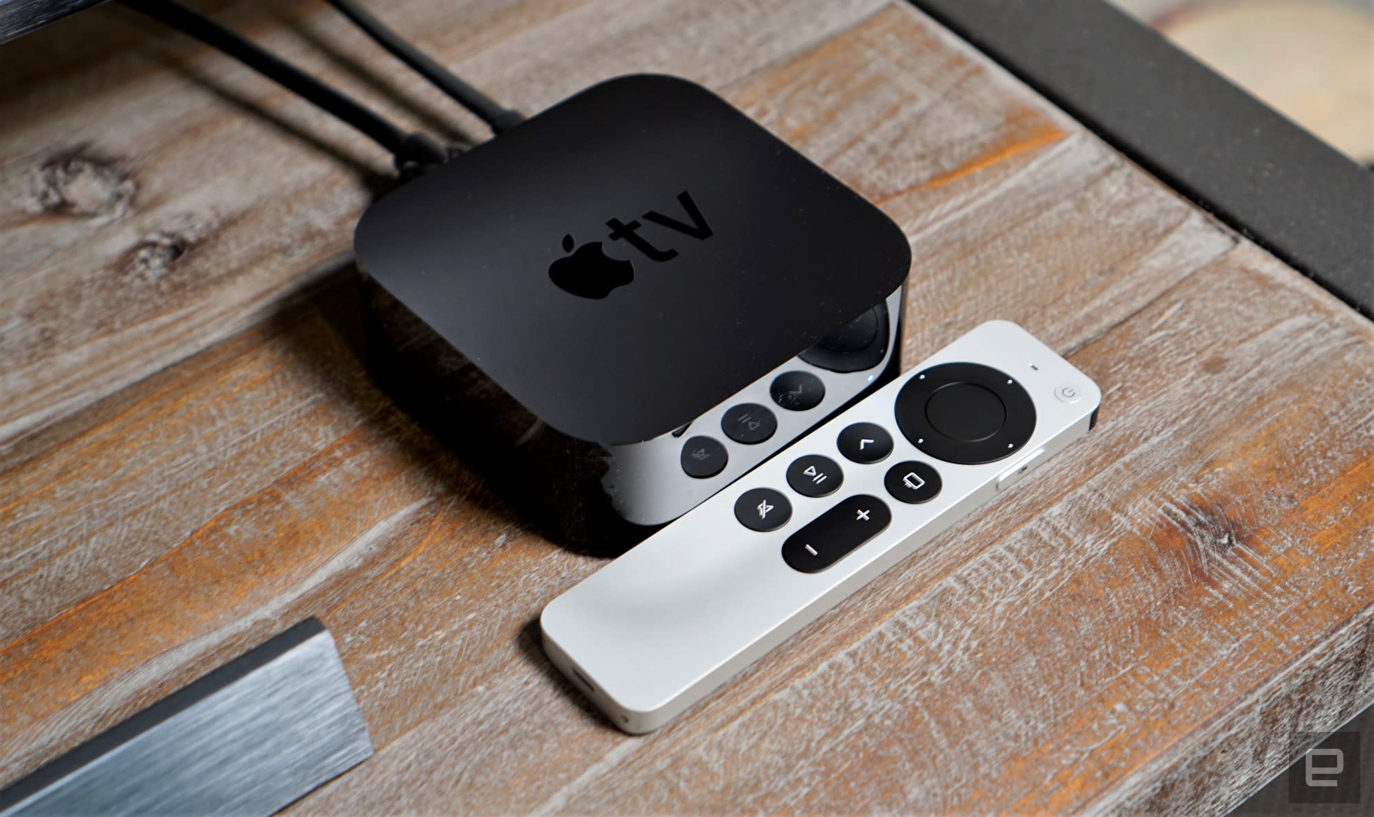
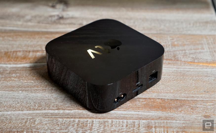
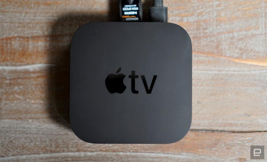
Let's get this out of the way up front: the new Apple TV 4K looks exactly like the last model, and it's a bit faster. But what really stands out is the new Siri remote, which is practically an apology for what came before. Instead of being elegantly thin and easy to lose, it's a bit chunky and easier to hold. Instead of an infuriating touchpad, there's a directional pad that also has touchpad capabilities. The new Siri remote is so good, I'd recommend that existing Apple TV 4K owners just buy it separately for $60 and skip the new box entirely.
Gallery: Apple TV 4K (2021) | 7 Photos
Gallery: Apple TV 4K (2021) | 7 Photos
For everyone else, though, is the revamped Apple TV 4K still worth a hefty premium over far cheaper streaming options? That's where things get complicated. The world of streaming video is a bit different now, compared to 2017 when Apple's last set-top arrived. For one, Apple offers its TV app on televisions, game consoles and even Roku's devices. That gives you full access to your iTunes library and Apple TV+. And if you still need some sort of streaming hardware, you can easily snag Roku's 4K stick with a voice-enabled remote for $40. So why, exactly, would you even think about giving Apple $179 (or $199) for something that hasn't changed much in years?
It all comes down to just how entrenched you are in Apple's ecosystem. I'll confess: even though I've tested out plenty of streaming boxes over the years, I've always come back to the Apple TV as my primary viewing device. I prefer the slick interface to Roku's dated UI. It had Dolby Vision when most others didn't. And, as an iPhone owner, I love having the ability to quickly AirPlay content, or mirror my screen. (Something that's now available on competing platforms, too.) Apple also won me over with its generous offer to upgrade HD iTunes purchases to 4K — that was particularly useful when Disney finally boosted its films to 4K last year.
The big downside before was the old Siri Remote, which was simply a pain to use. That’s why I’m so impressed by this revamp. The new Siri Remote feels practically anti-Apple. It's taller, thicker and its directional pad hearkens all the way back to the 2010 Apple TV's minimalist clicker. This isn't a company that often goes backwards design-wise. The revised Siri Remote is a sign that Apple that's finally responding to user complaints. Because of its bigger size and slightly curved aluminum case, it actually feels better to hold than the last model, which was just an incredibly thin and fragile rectangle. (Who puts glass on a remote? Only Apple!)
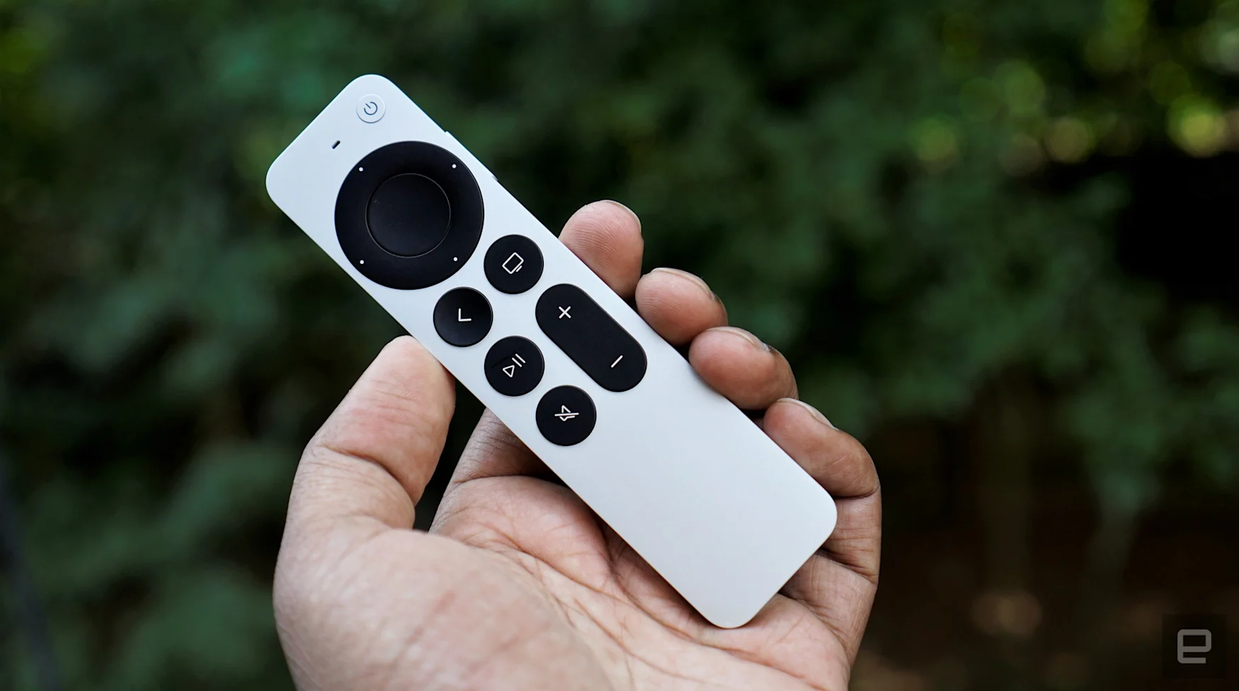
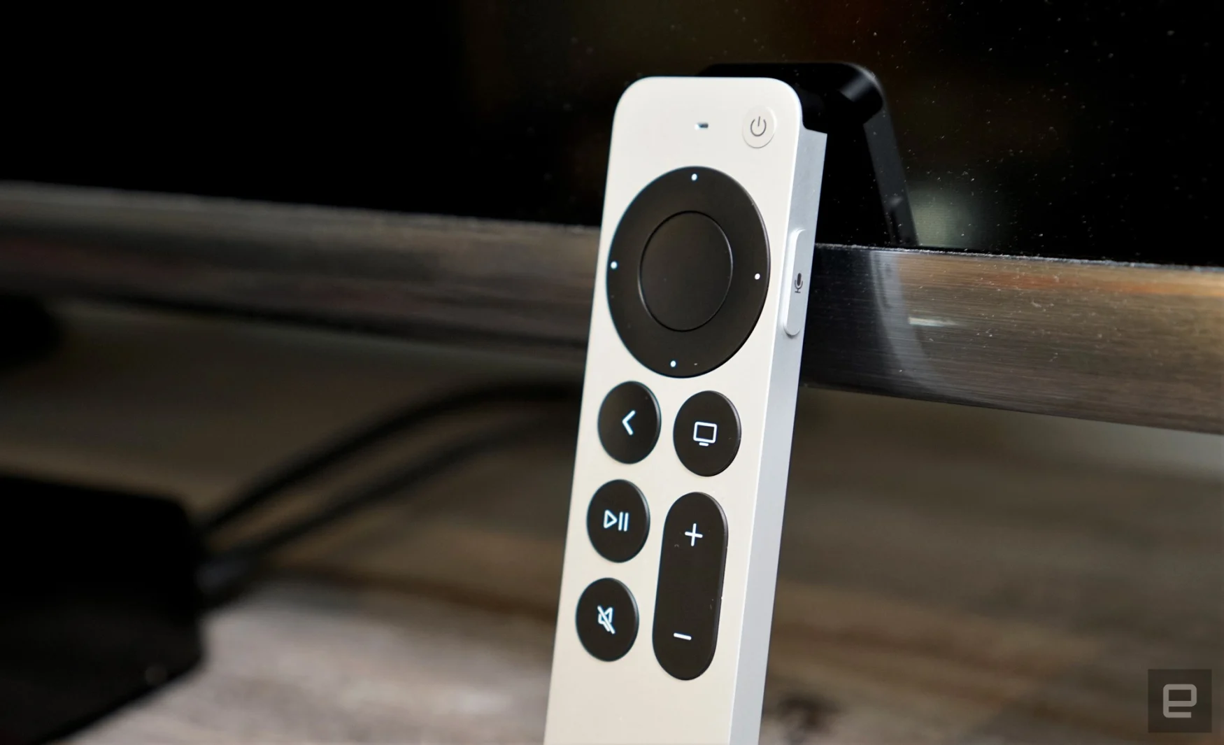
Based on my experience so far, that heft has also made it harder to lose the Siri Remote in my couch. Though that's definitely no excuse for not including AirTags, or some sort of remote finding feature, despite what one Apple exec thinks. On a brighter note, the revamped directional pad is a dream to use. It's perfect for making fine-tuned selections, like choosing between two movies or episodes listed near each other. But, it's also touch sensitive, allowing you to swipe around freely like on the last remote. And as a nice bonus, you can use the directional ring like a jog dial to scrub backwards and forwards in a video. That's reminiscent of the classic iPod scrollwheel, and it's far more accurate than just swiping left or right.
The layout is also more functional: a back button replaces the confusing "Menu" button, while the home, play/pause and unified volume controls all make a return. There's also a mute button up front, while the Siri voice controls are shoved over to the right side of the remote. That change kept throwing me for a loop at first, but after a few days I appreciated being able to activate voice commands without worrying about hitting any face buttons.
Apple also added a power button up top, allowing you to turn your TV on and off, as well as put the Apple TV to sleep. Unfortunately, since the TV power button relies on infrared, it couldn't actually control my TCL Roku TV, but that's a problem I have with most universal remotes. One other benefit of the new design: you can actually tell which way is up just by holding the remote.
I'd go as far to say that the new Siri Remote is a genuine selling point for the Apple TV. Given that Roku and Amazon haven't really innovated much with their remotes over the years, if you want something that feels new and fresh there aren’t many options. One downside is that you won’t be able to use the new remote as a game controller, as Apple removed the accelerometer and gyroscope. But I honestly can’t imagine actually playing anything using that old clicker.
