Apple Watch Ultra review: A big smartwatch with some little quirks

I love/hate its buttons.

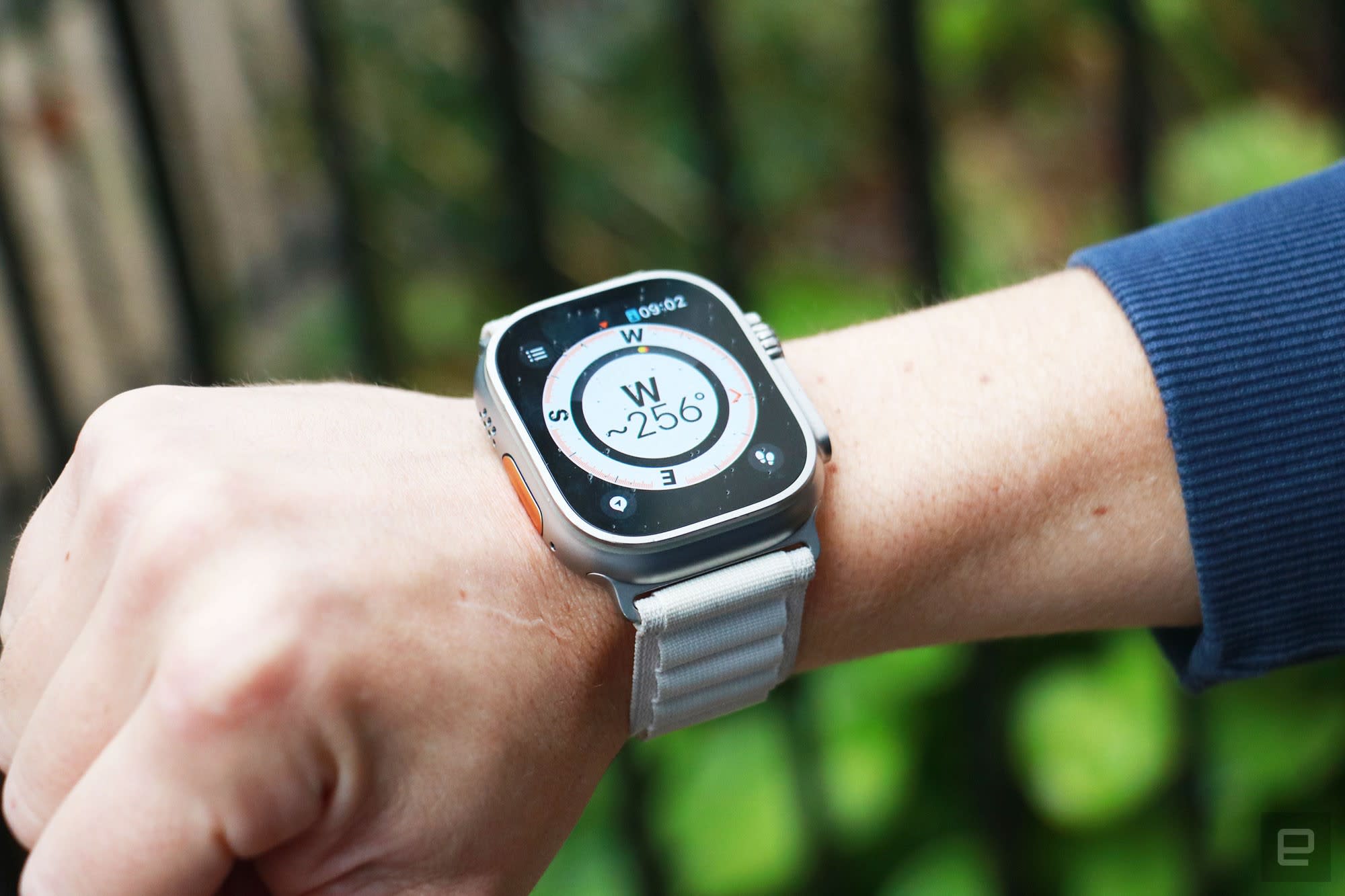
The Apple Watch Ultra on a wrist held in mid-air with a compass on its screen. The compass is showing the letter W with "~256 degrees" below it.
Cherlynn Low / Engadget

Sponsored Links

Cherlynn Low
Cherlynn Low|@cherlynnlow|October 5, 2022 9:00 AM

It’s embarrassing to admit, but I frequently get lost. Even in the middle of well laid-out Manhattan, my friends cannot trust me with directions. So while the idea of wandering in the wilderness with nothing but the stars and a compass to guide me is alluring, I’ve never dared to actually do it. When Apple launched the Watch Ultra and showed off its navigation and compass-based features, I was intrigued. And though I’m not a fan of underwater activities, I was still impressed to learn about the diver-specific features.

But Apple didn’t just design the Watch Ultra for explorers and divers. It also built some special features for endurance athletes, like dual-frequency GPS for more accurate route tracking and pace calculations. The Watch Ultra is packed to the brim with tools for various outdoor use cases, but are all the bells and whistles worth its $800 price?

Design

My immediate thought when I first saw the Watch Ultra was “This is the Cat phone of smartwatches.” It’s a monster truck of a watch. Not only does it have a bigger screen than most wearables on the market, it’s also heavier. The Watch Ultra weighs a whopping 61.3 grams (2.16 ounces), which is almost 20 grams (0.7 ounces) more than Samsung’s Galaxy Watch 5 Pro. Meanwhile, the stainless steel 45mm Series 8, which is the next heaviest Apple Watch, comes in at 51.5 grams (1.81 ounces).

But despite sporting a 49mm screen, the Watch Ultra actually feels less clunky than Samsung’s Galaxy Watch 5 Pro, which uses a 45mm titanium case. I found the Watch 5 Pro uncomfortable compared to the Ultra. This is most likely because Samsung’s lugs and band curve in a way that makes it feel like a cuff. Even if you swapped out the band for something thinner, the curve is built into the frame and hugs your wrist like a vice grip.

Meanwhile, the Apple Watch Ultra’s underside is just like those on the Series 8 and SE. It’s mostly flat with slightly curved edges, and you attach straps by sliding them into a groove. I used the company’s ocean band when I first started testing the Ultra, and its “tubular geometry” (Apple’s words, not mine) is supposed to help it stretch over wetsuits while resisting water.

The bright yellow version I received is eye-catching and feels like a series of small rubber straws glued together. It makes a statement and is a conversation starter, but it wasn’t stretchy enough to simply pry off my wrist. Personally, I prefer the alpine loop strap. It still isn’t very stretchy, but it has a lower profile than the ocean band and is adjustable enough to fit my wrist perfectly. Finally, you can choose to get your Watch Ultra with the Trail Band, which is a more typical strap with velcro attachment and a pull tab that makes it easier to adjust. If none of these appeal to you, the good news is you can also use one of the bands for the standard watches instead.
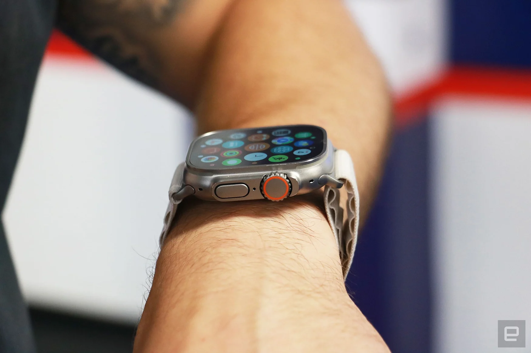
Side view of the Apple Watch Ultra on a person's wrist, showing the apps gallery on its screen. Facing the camera are the watch's Digital Crown with an orange ring on it, as well as the dock button.
Cherlynn Low / Engadget

Regardless of the band you pick, the Watch Ultra’s case is, to use the technical term, a chonkster. For my relatively small wrist, it looks overwhelming and covers pretty much the entire width of my arm. On others with larger wrists, though, the Ultra looked comparable to a regular timepiece.

I don’t mind that it’s chunky, but some of the Ultra’s other design elements were frustrating. Apple added a titanium guard to the side to protect the digital crown from accidental rotations, which makes sense since the crown is also about 30 percent bigger than the Series 8 and has coarser grooves. The company did this to make the dial easier to rotate with gloves on, and it also raised the side button for the same reason.

When I tried using these controls with a pair of thick work gloves on, they were indeed easy to maneuver. But they frequently got triggered by accident, causing a lot of frustration.

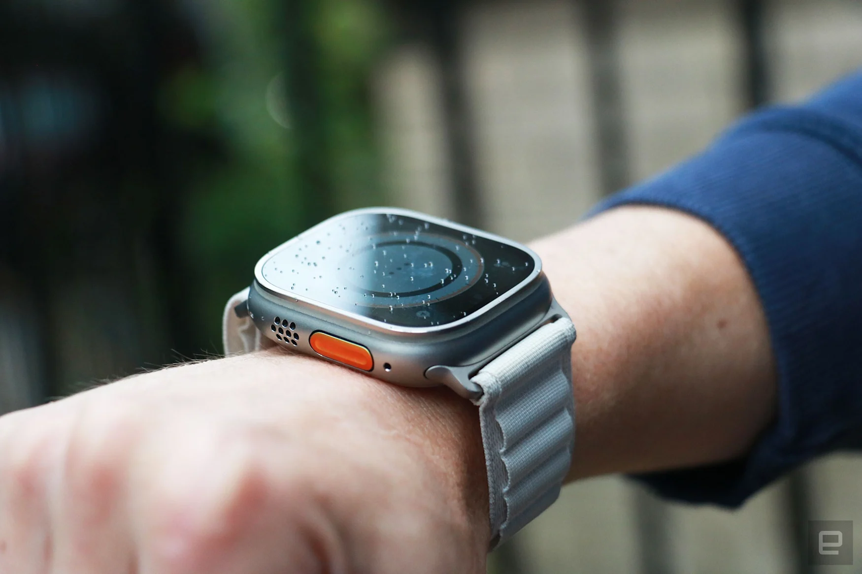
On the Watch Ultra’s left side sits an orange Action button and a speaker grill. The titanium case extends straight up to surround the sides of the sapphire crystal screen, which is flat instead of slightly curved like the Series 8 or SE. This gives it a weird shape, but only if you look at it from the side. From the top down, the Ultra looks just like a 45mm Series 8.
Cherlynn Low / Engadget

Hiking with the Watch Ultra

To get a better sense of the Watch Ultra as a companion for outdoor adventurers, I went on a moderate hike in New Jersey’s South Mountain reservation without a map. I was accompanied by our video producer Brian, who had a 3.2-mile trail downloaded to his phone on AllTrails, but that was for backup purposes only. I was hiking blind.

I activated the Backtrack feature on the Watch Ultra and created a Waypoint at the parking lot just before we embarked on the trail. I also started a hiking workout to help monitor the time and distance we’d covered.

Even with a map as a failsafe, we got lost a few times. On one of those occasions, we only realized we were going the wrong way when I noticed that the watch was showing us going in a straight line. Brian heard me say that, recalled that we should have made a pretty sharp left turn a little while ago and pulled up his map to confirm. Would we have gotten hopelessly lost had I not been checking the Watch Ultra? Probably not. We would have noticed we weren’t where we were supposed to be at some point. But the device saved us some time and kept us on the right track.

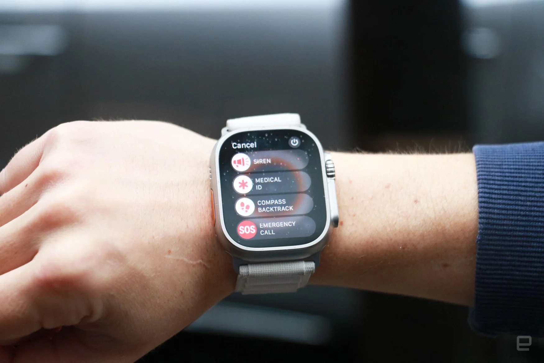
Midway through the hike, we tested the new Siren feature that uses the Ultra’s two onboard speakers that Apple said make it 40 percent louder than the Series 8. The company said one of the speakers was specifically designed to also function as an emergency siren, playing a pattern of beeps and alarms to alert your companions or nearby emergency responders to your location.

The Apple Watch Ultra with alpine loop on a person's wrist, showing the emergency menu. Options on display are, from top to bottom, Siren, Medical ID, Compass Backtrack and Emergency Call.
Cherlynn Low / Engadget

I asked Brian to walk away before I went and hid behind a tree. Then I played the siren and did my best to stay out of sight. Brian found me within five minutes. Granted, I didn’t go very far, and there weren’t huge trees with thick trunks. Brian said that the siren initially sounded like a bird, and indeed, the first few sounds the watch plays are a series of shrill chirps. But they give way to wailing patterns and the morse code beeps for SOS, so people eventually won’t mistake them for anything natural.

The siren seemed plenty loud to me, but from Brian’s perspective, it got somewhat lost in the sound of leaves rustling and a nearby gurgling stream. Obviously, the closer Brian got to me, the clearer he heard the siren. But don’t count on the Watch Ultra to draw rescuers to your exact location from a mile away.

During our hike, we came across a cute little creek and wanted to mark it in case we decided to come back. Since I had set the Watch Ultra’s action button to set a waypoint, I pressed it once to drop a pin, and the system prompted me to label the spot. I didn’t have to start from scratch — the watch had already filled in a suggested name, and I could use the onscreen keyboard to edit it. With the Ultra’s roomy screen, by the way, typing is surprisingly less cumbersome than on smaller wearables.

Thanks to its increased brightness of up to 2,000 nits, the Watch Ultra’s screen is easy to see in direct sunlight. A lot of this also has to do with Apple’s interface, which mostly uses bold, colorful fonts against a dark background.

Off-angle view of the Apple Watch Ultra with alpine loop on a person's wrist. From this perspective, the orange Action button and speaker grill on the left edge are in view, while the screen's contents are dim.
Cherlynn Low / Engadget

Though I found it convenient to quickly set a waypoint with the Action button, I often accidentally pressed it when trying to push the digital crown. My thumb would naturally rest along the side of the case while my index finger reached for the dial, which frequently caused both buttons to be pushed at once. This meant that I kept getting the screen for creating a waypoint instead of going to the home page, for instance.

It was more annoying after I had set the action button to start a workout. The number of two-second hikes that are now in my activity history are testament to how easy it is to hit the action button. Over time, I learned to place my thumb where the strap connects to the case. But if you’re really struggling you can always set the action button to do nothing (though that would defeat its entire purpose altogether).

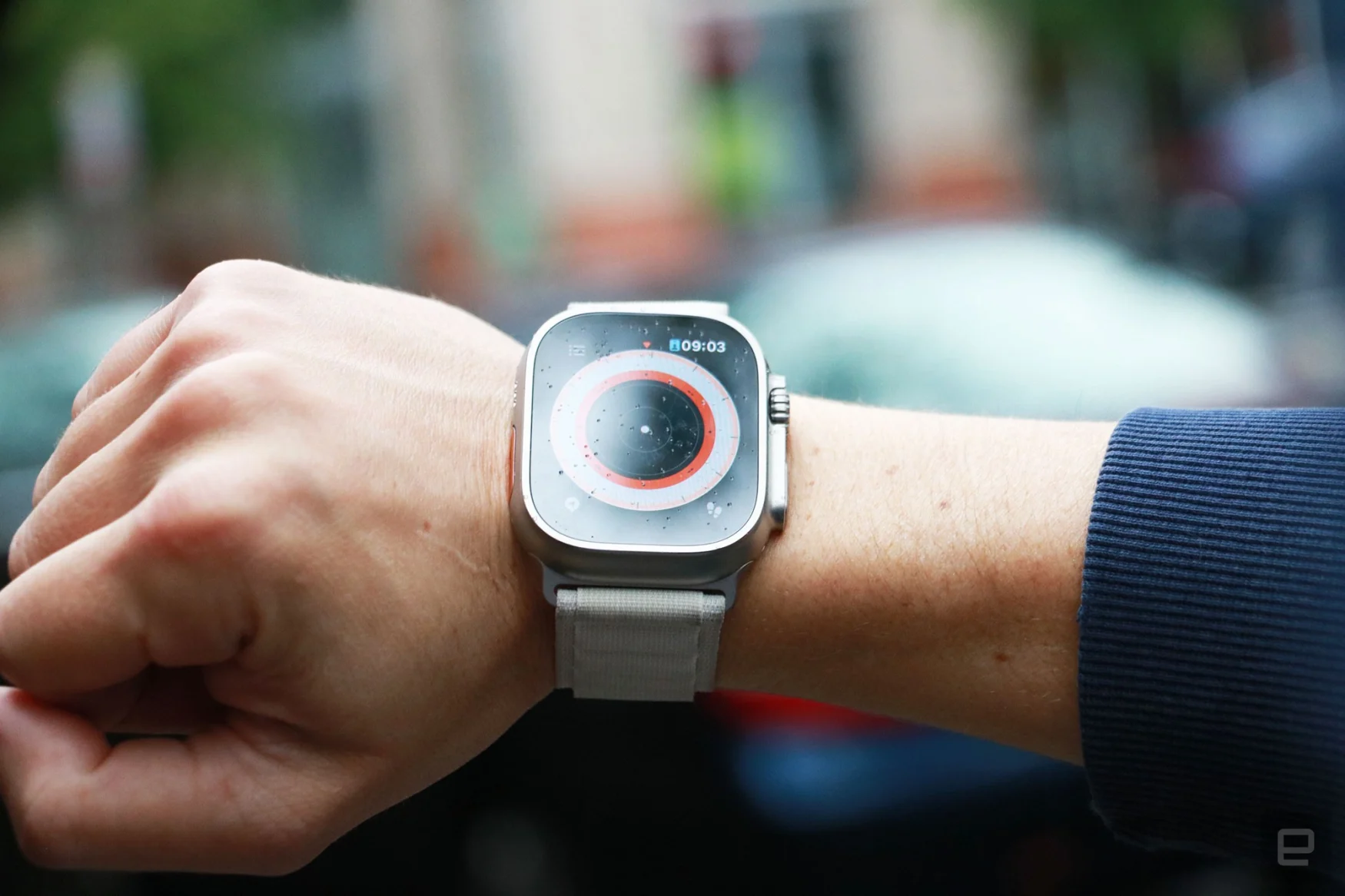
When we were nearing the end of our trail, Brian and I decided to use the waypoint we had created for the parking lot to find the exit. It was slightly confusing to find the page that would show us the directions — we had to rotate the crown while in the Compass app to zoom in and out of different views. The Orienteering view, which appears after you twist the dial all the way in, shows the route you’ve been taking and your waypoints. Tapping one of these flags brings up a list of your saved sites and you can choose one to navigate to. The Watch Ultra will show how far away you are from the spot, as well as in what general direction (left or right) you should head.

The Apple Watch Ultra with alpine loop strap on a person's wrist. The screen shows the Compass app's so-called technical view, with a white dot in the middle.
Cherlynn Low / Engadget

I followed the onscreen instructions towards the parking area, which the Watch said was just 400 feet away. I’ll confess: At this point I could already tell where the car was, so it was hilarious when, hundreds of feet away from the vehicle, the Watch buzzed to tell me I had arrived.

The GPS wasn’t super accurate, but I wasn’t expecting it to bring me within inches of the car. I also took this opportunity to check on the Backtrack feature to see if the Watch Ultra could reliably bring me back through the trail we had completed.

Once again, I found the interface confusing. Tapping the footsteps symbol on the bottom right of the Compass app brought up options to retrace or delete the steps I had saved. When I tapped retrace steps, it took awhile for me to realize which direction to turn and how to follow the orange line on the screen. I finally caught on when I started walking back in the direction I had come from, and saw some progress on the watch. In general, I find the Waypoint feature more useful than Backtrack, as it creates a more direct path to where I want to go, as opposed to making me retrace my entire journey.

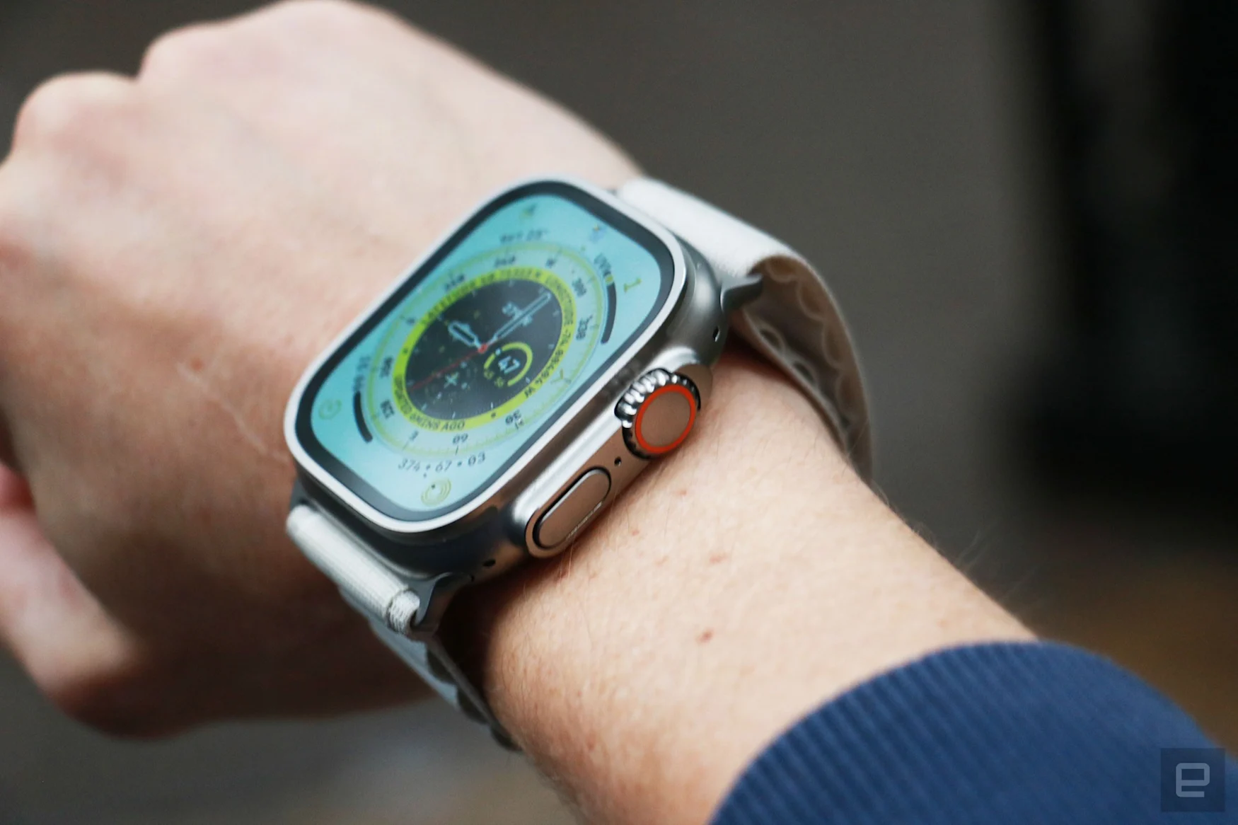
We didn’t trek into the night, but had it gotten dark, we could have also used the Night mode version of the Wayfinder watch face. This changes the interface so all onscreen elements are in red while the background is black, which makes it easier for you to see in the dark.

Cherlynn Low / Engadget

Regular health and fitness tracking

In pretty much every other respect, the Watch Ultra behaves exactly like a typical Apple Watch. It’ll still automatically track your outdoor runs and walks. Although, thanks to its improved dual-frequency GPS runners should be able to get more accurate results even in cities dense with high-rises.

I’m not a big runner, but I can imagine how helpful it must be to set the Action button to launch a workout and program subsequent presses to mark laps and segments or change sports. But since most of my exercises involve weights, the watch’s oversized hardware actually got in my way.

In fact, the most frustrating thing about using the Watch Ultra as my daily driver has surprisingly been during my daily workouts. In the past, when testing the Series 8 and Samsung’s watches, I bragged about never needing to flip the screens inside my wrist to prevent damaging them when racking weights.

I can’t say the same about the Watch Ultra, though, and not because I’m worried about cracking the display. It’s because whenever I was doing burpees, planks or mountain climbers, my wrist would keep pressing into the dial and cause the Ultra to stop tracking my workout. I’ve lost count of the number of times I’ve screeched obscenities at the watch midway through a HIIT class, causing my classmates to look around in confusion. Eventually, I gave up and started turning the watch inside my wrist before each class — it’s that or lose time during each session I track. Thankfully, in spite of this minor inconvenience, I was still able to lose 4 percent body fat during a six-week challenge and gain 2.8 pounds of muscle. (Yes, this is a not-so-humble brag.)

Off-angle view of the Apple Watch Ultra on a person's wrist, with the Wayfinder watch face on its screen.
Cherlynn Low / Engadget

Because the Watch Ultra is humongous, wearing it to bed is understandably less comfortable than the smaller Series 8 or SE. I definitely felt it weighing my wrist down, which made it harder to fall asleep. Like the Series 8, the Ultra has an onboard skin temperature sensor that allows for retroactive ovulation tracking. You’ll need to set up a sleep schedule and focus before the Watch will log your rest.

You’ll also find other watchOS 9 features like medication logging, as well as crash detection via the onboard high-g accelerometer, and you can set the Action button to turn the screen into a flashlight, which is easier to find in the dark than a phone.

Performance and battery life

Though I was concerned about the Watch Ultra’s battery drain during our hike, in daily use the device lasted longer than expected. I usually got almost three days out of it before having to recharge, and that’s with it tracking my daily walks and workouts, as well as controlling my soundtrack. That more than lines up with Apple’s promised 36-hour runtime, and I never worried about running out of juice.

I did completely forget to check the battery level one day and found myself working at a cafe with just 20 percent left. I enabled Low Power Mode, which turned off the Always On Display and features like background heart rate measurements, heart rate notifications, irregular rhythm alerts and blood oxygen measurements. It also disabled the Wi-Fi and cellular connections, which led to notifications being delayed.

With this on, Apple said you can get up to 60 hours on a charge. Since I only enabled Low Power Mode at 4:30pm with 17 percent left, I wasn’t expecting the watch to last another day. But, four hours after I turned it on, the Watch Ultra still had 14 percent of juice.

Wrap-up

The Apple Watch Ultra might be the ultimate smartwatch. Sure, it doesn’t have the same long-lasting battery as some Garmin or Fitbit wearables, and it lacks some of the exercise-tracking features those two offer like rep-tracking or recovery stats. Those looking to track their sleep might prefer the lower profile of the Series 8 or SE. People who don’t dive, hike, bike or run outside regularly also don’t need to spend the extra cash on the Ultra — the Series 8 is more than capable as a daily fitness tracker. But with a durable build, helpful tools for specialized use cases and watchOS’ general capability as a mainstream smartwatch platform, the Watch Ultra is a powerful companion that most outdoor enthusiasts can rely on.

All products recommended by Engadget are selected by our editorial team, independent of our parent company. Some of our stories include affiliate links. If you buy something through one of these links, we may earn an affiliate commission. All prices are correct at the time of publishing.
Apple Watch Ultra review: A big smartwatch with some little quirks